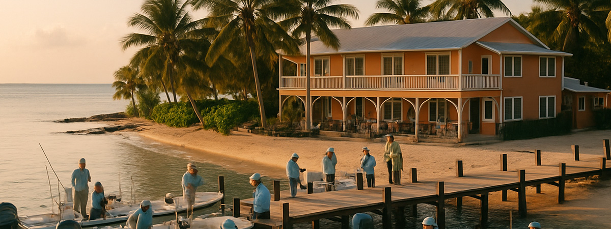
Fishing lodges operate in some of the most awe-inspiring places on earth—and the experiences they offer are just as unforgettable. But when it comes to how those experiences are presented online, many lodge websites are falling short.
At Thrive, we believe a website shouldn’t just be a digital brochure—it should tell your story, build trust, and make it easy for guests to take the next step. To see how today’s fishing lodges are measuring up, we conducted a comprehensive audit of 100 lodge websites across the U.S., Canada, the Bahamas, and beyond.
Some were resort-style destinations with polished branding and modern design. Others were bare-bones sites run by passionate owners who clearly prioritize the on-the-water experience over marketing. But across the full spectrum, we found a few consistent patterns—both in what’s working and what’s holding lodges back.
In this article, we’ll share what we learned from the audit, where most lodge websites are missing the mark, and what simple steps can lead to better guest experiences and more bookings.
The Audit Framework

To evaluate each lodge fairly, we scored every website using a consistent framework built around four core categories:
1. Strategy
We assessed how well the site communicated the lodge’s purpose and moved users toward taking action. This included evaluating clarity of messaging, user flow, calls to action, and the quality and depth of content.
2. Aesthetics
Visual design can be subjective, but we focused on objective indicators: professional photography, consistent branding, quality of typography, and whether the overall look supported the lodge’s identity.
3. Usability
This category measured how easy it was to use the site—on both desktop and mobile. We looked at navigation structure, readability, consistency of layout, and mobile-friendliness.
4. User Experience
Beyond just usability, we looked at performance, emotional tone, and how frictionless the booking or inquiry process felt. We also considered technical consistency across platforms and devices.
Each sub-criterion within these categories was scored on a 1–7 scale, and those scores were averaged to generate both category and overall scores.
In addition to scoring, we also recorded whether or not each site included key features—like online booking, email signup, blog content, and more. These “true or false” checks gave us insight into how well fishing lodges are using their websites to build trust, capture leads, and drive bookings.
The Scoreboard
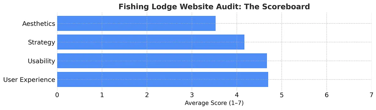
Across all 100 websites, we saw a wide range of quality—from professionally designed resort-level experiences to outdated DIY builds. But when you average the data across all four core categories, a few clear trends emerge.
Even though most sites were functional—meaning users could navigate them, read the content, and find basic information—their ability to build trust, communicate a clear story, and create a compelling visual experience often fell short.
The biggest underperformer was Aesthetics, with many lodges relying on dated templates, low-quality imagery, or inconsistent branding. Strategy wasn’t far behind—few sites had clear messaging or intentional calls to action that guided users toward booking.
By contrast, User Experience and Usability scored the highest, suggesting that even sites lacking visual polish still managed to be fairly easy to use on both desktop and mobile.
The Biggest Misses
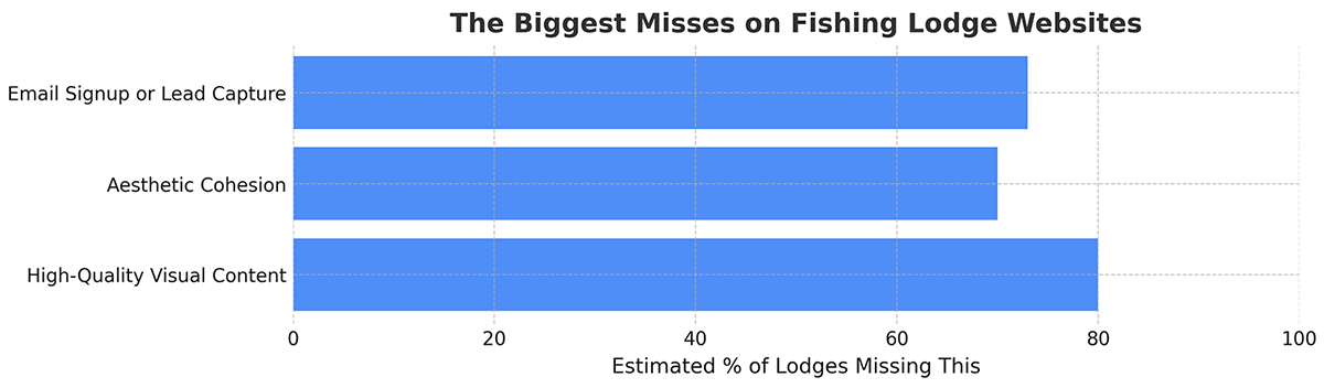
After auditing 100 fishing lodge websites, the clearest gaps weren’t technical—they were emotional.
Many lodge sites had all the expected elements: a homepage, a few photos, basic trip details. But what most were missing was the ability to make a visitor feel something. To inspire confidence, trust, or the simple urge to book a trip and get out on the water.
Here’s where the biggest opportunities are being missed:
- High-Quality Visual Content. Nearly every lodge had photos—but few had the kind of rich, immersive imagery that sparks curiosity or emotional connection. Great photography (and even better, video) can tell the story of your lodge without saying a word. Too often, the visual assets feel like an afterthought.
- Aesthetic Cohesion. Many sites suffer from inconsistent branding, outdated design, or a lack of hierarchy and flow. The result? A site that may function—but doesn’t invite or excite.
- Email Signup or Lead Capture. Fewer than 30% of sites offered any kind of email opt-in. That’s a major missed chance to stay in touch with warm leads who aren’t ready to book yet but may be planning for next season.
The takeaway? It’s not about having more features—it’s about delivering more feeling. The most successful websites made visitors want to be there before they ever stepped foot on property.
What the Best Sites Have in Common
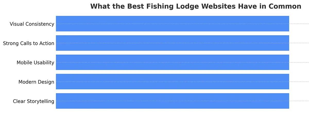
While most fishing lodge websites had room for improvement, there were a handful that stood out from the pack. These sites weren’t just pretty—they were purposeful. They made it easy for guests to understand the experience, build trust, and take the next step.
Here’s what those high-performing sites tended to share:
- A clear story. Whether it was the lodge’s history, the uniqueness of the fishery, or the people behind the operation, these sites conveyed more than just logistics. They made you feel something.
- Clean, modern design. Thoughtful use of typography, layout, and whitespace gave these sites a professional and polished appearance—without feeling corporate.
- Mobile-first usability. The best sites were fast, intuitive, and easy to use on any device. Navigation made sense, content was scannable, and nothing felt buried or bloated.
- Well-placed calls to action. Whether it was “Check Availability,” “Plan Your Trip,” or “Request a Quote,” the path forward was clear—and available on every page.
- Visual consistency. From the homepage to the contact form, these sites maintained consistent branding, tone, and structure—helping guests feel confident and comfortable throughout.
You don’t need a huge budget or resort-level infrastructure to build a great website. What you do need is clarity, consistency, and intention. The best lodge websites didn’t rely on gimmicks or trends—they focused on telling a story, building trust, and making it easy to act.
Final Thoughts
Auditing 100 fishing lodge websites gave us a clear view of where the industry stands—and where it can go. Most sites do a decent job of sharing the basics. But too many stop there, missing the opportunity to tell a compelling story, guide guests with intention, and build trust that leads to bookings.
The good news? It doesn’t take a massive overhaul to make meaningful improvements. A few strategic updates—refining your messaging, improving mobile usability, updating visuals, or making it easier to inquire—can dramatically change how guests experience your brand online.
At Thrive, we specialize in helping fishing lodges and outfitters turn their websites into powerful tools for growth. Whether you need a fresh start or just a tune-up, we’d love to help.